7 Tips for Creating Social Media Graphics That Convert (Fast!)
Let’s be real: designing social graphics can feel like a full-time job sometimes. And with all the algorithm changes, new features, and constant demands for content, it’s easy to get lost in the aesthetics and forget the real goal—conversion. But what if I told you that you can design social graphics that not only look stunning but actually drive sales and engagement… without spending hours on each one?
Yep, it’s possible. Let’s dive into the key elements that will help you design conversion-focused social graphics faster than ever before.
1. Start with a Clear Call-to-Action (CTA)
First things first: what do you want your audience to do after seeing your graphic? Whether it’s “Shop Now,” “Sign Up,” or “Read More,” a strong, clear call-to-action is your golden ticket to driving conversions.
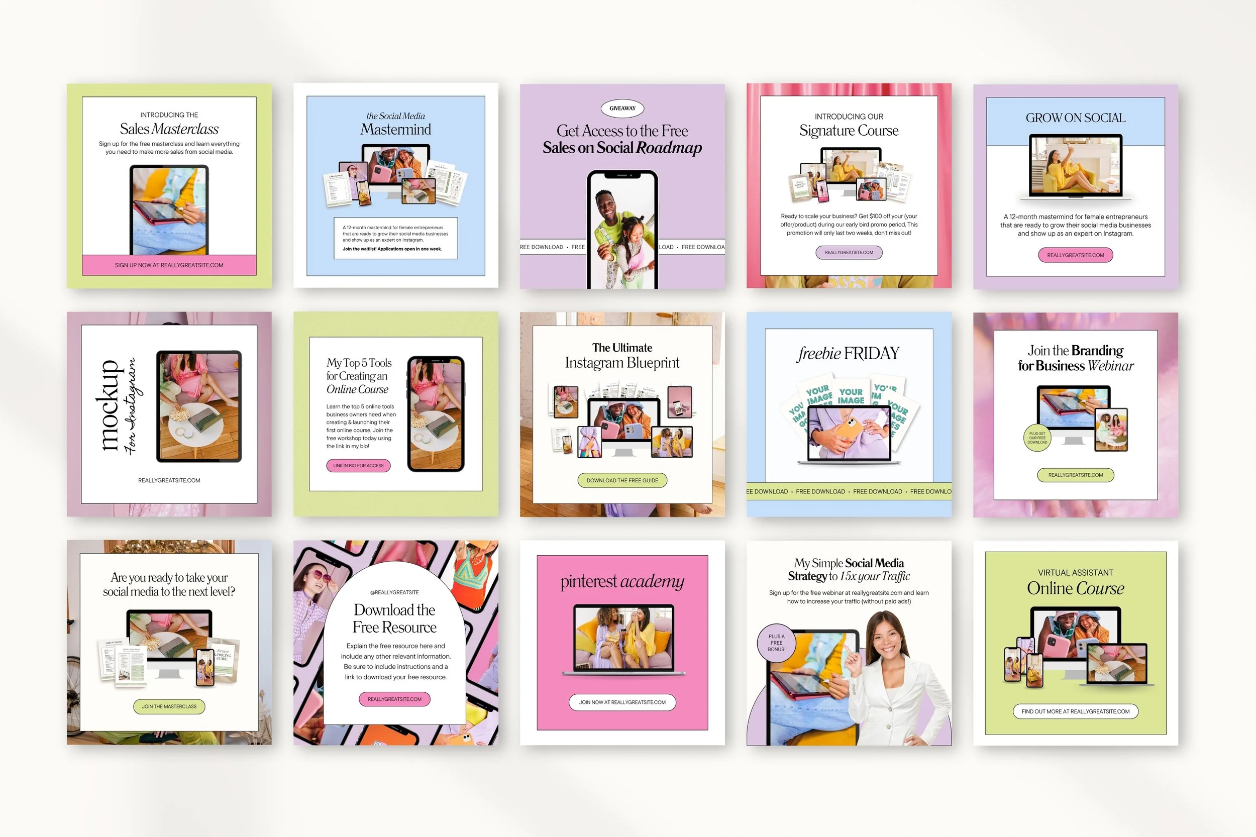
But here’s the thing: crafting an effective CTA doesn’t have to take ages. With my Instagram Canva Template bundle, you can easily insert your CTA into a ready-made design that’s proven to work. No more guessing where to place buttons or how to make text stand out—my templates have you covered.
Check out these digital product mockup templates from my bundle, where the CTA is clear, making it easy for your audience to take action.
2. Use Eye-Catching Imagery that Aligns with Your Brand
People are naturally drawn to images before they read any text, so make your visuals count. But it’s not just about slapping a pretty photo onto your design—your imagery needs to align with your brand and evoke the right emotions. Conversion happens when people feel something.
Not sure where to find those perfect on-brand images? You can use Canva’s extensive library, or read my post on How to Find the Best Canva Stock Photos Using Brand Codes which reveals hidden gems to enhance your design.
3. Incorporate Strategic Typography
Fonts aren’t just for flair—they’re functional. The right typography can guide your audience’s eye through the design and reinforce your message. Use bold, legible fonts for your main message (especially for your CTA!) and complement it with smaller, softer fonts for secondary information.
With my Canva templates, you won’t need to stress about font pairings or alignment. They’re pre-designed with strategic typography. If you’re looking for inspiration on which fonts to use, check out my blog post on 40+ Best Canva Sans-Serif Fonts for Aesthetic Designs.
4. Embrace White Space Like a Pro
It’s tempting to fill every inch of your graphic with text, images, and design elements, but less is more. White space—aka the breathing room around your elements—helps focus attention on what really matters. A cluttered design can overwhelm your audience, while a clean, minimal one feels more inviting.
Not sure how to balance the elements? My Canva template bundle is designed with ample white space to make your message shine. Plus, if you need ideas on which elements work well in clean designs, check out my ultimate list of 250+ Canva Elements Keywords for Aesthetic Designs.
5. Stay Consistent with Your Brand Colors
Colors are more powerful than you think. They can evoke emotion, build recognition, and encourage action—all of which are essential for driving conversions. But here’s the catch: consistency is key. The more you use your brand colors across your designs, the more recognizable and trustworthy your content will be.
The great news? My templates make it easy to stick to your brand’s color palette. With customizable color schemes, you can update the templates in seconds to match your brand’s unique look and feel. For help in discovering great color combinations, visit my blog post on How to Customize Canva Templates to Match Your Brand.
6. Make It Mobile-Friendly
With most people browsing on their phones, it’s crucial that your social graphics are designed for small screens. Keep text minimal, imagery bold, and your CTA easy to tap. Vertical designs work best for platforms like Instagram Stories and Pinterest, while square graphics are great for Facebook and Instagram feeds.
Always preview your design on mobile before hitting publish to make sure everything looks clean, legible, and ready to convert.
7. Repurpose Templates to Save Time
Why reinvent the wheel for every new post? Instead, create a set of templates that you can tweak and reuse for different campaigns. My Canva template bundle is perfect for this—just drag and drop new content into pre-designed layouts, and you’re good to go.
This not only saves you tons of time but also keeps your brand visuals consistent, which is key to building trust and driving conversions. For more details on how to repurpose templates, check out my post on 30+ Best Canva Examples for Instagram Graphics that Stop-the-scroll.
Final Thoughts
Designing conversion-focused social graphics doesn’t have to be time-consuming. By focusing on these key elements—clear CTAs, on-brand imagery, strategic typography, and more—you can create designs that actually drive action in a fraction of the time.
And if you want to speed up the process even more, check out my Canva template bundle. It’s packed with pre-designed layouts that are optimized for conversions, so you can spend less time designing and more time growing your business.

