The Ultimate Guide To Adobe Lightroom
Ever been curious about those gorgeous photos you’ve been seeing all over the Gram? You might be surprised to know that it’s not always about being an amazing photographer… or having expensive camera gear. Most of the magic actually lies in the photography edit… AKA using Adobe Lightroom! Read along for my guide to Adobe Lightroom, which includes access to my free and paid Lightroom preset collections!
At least half of my travels so far have been solo. In term of photography, that means handing my camera over to pretty much anyone nearby who is willing to take a photo for me. As I’m sure you can imagine, some of my photos do require a bit of post-processing. Fortunately, I’ve grown as a photographer over the past few years by learning the ins and outs of Adobe Lightroom and developing my own personal editing style.
Below, you’ll find my ultimate guide to Adobe Lightroom and Lightroom Presets, which will take you through the steps, tips, tricks and resources that you need to master Lightroom editing like the pro Content Creator I know you are. ;) I’ve included important info on Lightroom Mobile CC, along with travel photo tips & access to my FREE Lightroom Presets (yep, ya heard that right).
What is Adobe Lightroom?
Adobe Lightroom is the most widely recognized editing suite for photographers in the world today. This powerful editing software offers advanced tools to help you get as much detail as possible from your photos.
This professional-standard software also acts as a library for your images. Adobe Lightroom allows you to do a large amount of your photo manipulation efficiently and quickly (meaning less time you have to spend in the post-production process!). Lightroom is undoubtedly the most popular choice for image processing, among professionals, amateurs and everything in between.
What are Lightroom Presets?
In Lightroom, you can apply “Presets” to photos, which are essentially filters that you can apply to achieve a certain look. Once installed, presets can simplify your editing process and free up the amount of time you spend post-processing your images.
While I do edit a majority of my photos on the desktop version of Lightroom (as you have a wider range of advanced tools and more control), the mobile version of Lightroom is incredibly powerful as well! And the best part about the Lightroom mobile app? It is completely free to use, giving you the power to create beautiful photo edits right from your phone!
Is Adobe Lightroom free?
The answer depends on which version of Adobe Lightroom you want to use:
Adobe Lightroom Mobile CC (mobile use): This version of Lightroom is completely free to use and is available on the mobile app store.
Adobe Lightroom Classic CC (desktop use): This version of Lightroom is not free. However, there are a few reasonably priced plans to choose from on both the Adobe website and Amazon. If you don’t have Lightroom installed, you can purchase the Adobe Creative Cloud Photography Plan. This includes a 1 year subscription to both Adobe Lightroom and Adobe Photoshop, along with 20 GB of storage.
Adobe Lightroom CC (desktop use): This version of Lightroom is not free. However, there are a few reasonably priced plans to choose from on both the Adobe website and Amazon. If you don’t have Lightroom installed, you can purchase the Adobe Creative Cloud Photography plan. This includes a 1 year subscription to both Adobe Lightroom and Adobe Photoshop, along with 20 GB of storage.
How to Install Lightroom Presets
Installing Lightroom presets will depend on which version of the software you have installed, and whether you are using Adobe Lightroom for mobile or desktop.
My process for setup has now changed! If you would like the detailed breakdown of both versions, please refer back to the following tutorials on my blog:
Free Lightroom Mobile Presets
Alright— serious question.
Anyone else fed up with the “bright & airy” presets all over the internet that end up making your photos look… kind of just washed out? Yea girl, me too. Well I have great news for you! I’ve created 3 Lightroom mobile presets to make your photos look BOMB and I’m giving them away for absolutely FREE. Yep, so crazy of me— I know.
Photography Tips and Camera Settings
Although Adobe Lightroom is an incredibly powerful software, it can’t save every photo, and it’s important to get things right inside the camera before shooting. You can always set your camera to auto settings, but if you’re really interested in taking pro Instagram photos, I highly suggest checking out my detailed guide on how to shoot in manual mode with your DSLR. Otherwise, here’s a few quick tips:
When you’re going to shoot, remember that slightly under-exposed photos are better than over-exposed photos, as they will retain more detail. Slightly under-exposed images can typically be saved, while over-exposed images sometimes can’t be recovered in post-processing.
Another VERY important note: it is SO critical to always shoot in RAW file format if you are using a DSLR camera. RAW, just like JPEG, is a type of image format. However, unlike JPEG, RAW saves much more information about the image. This allows you to have nearly endless possibilities while editing in Adobe Lightroom (given that your camera settings are correct). The biggest downside to RAW images: they take up a TON of space on your memory card. You’ll therefore need to make sure you have an SD card large enough to handle your entire shoot.
All things said, making the switch from JPEG to RAW is well worth it. JPEG format will give you a prettier “straight out of camera” image than RAW will, as the camera compresses all of the information and does the hard work for you. However, this compression limits your options much more than when shooting in RAW. RAW files technically aren’t images at all- they are simply stored information, waiting for you to do something with them. With that being said, they do require more work than JPEG. So if you’re not planning on editing your photos often, you may want to stick with JPEG format.
How to use Lightroom Presets
Once installed, Lightroom presets can dramatically transform your images and simplify your overall photo editing process. With that being said, it’s important to note the following:
While Lightroom presets are a great starting point for photo editing, many (if not most) images WILL need additional processing after a preset is applied. Because every image is different, you will simply not be able to use a “one size fits all” approach to Lightroom presets.
More often than not, the white balance or exposure of your image will need to be adjusted after applying a preset. Fortunately, this can be accomplished easily using the sliders in the Develop Module of Adobe Lightroom.
In general, you will need to play around with the tools in Lightroom and find a happy medium for your edit!
Lightroom Editing Tips
Below, I’ve listed a few of my best Lightroom Workflow tips for making adjustments in Adobe Lightroom. This should ideally help you understand how to use and edit your Lightroom presets.
White Balance:
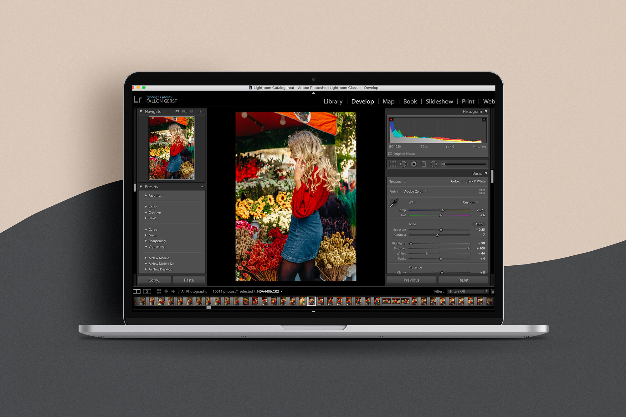
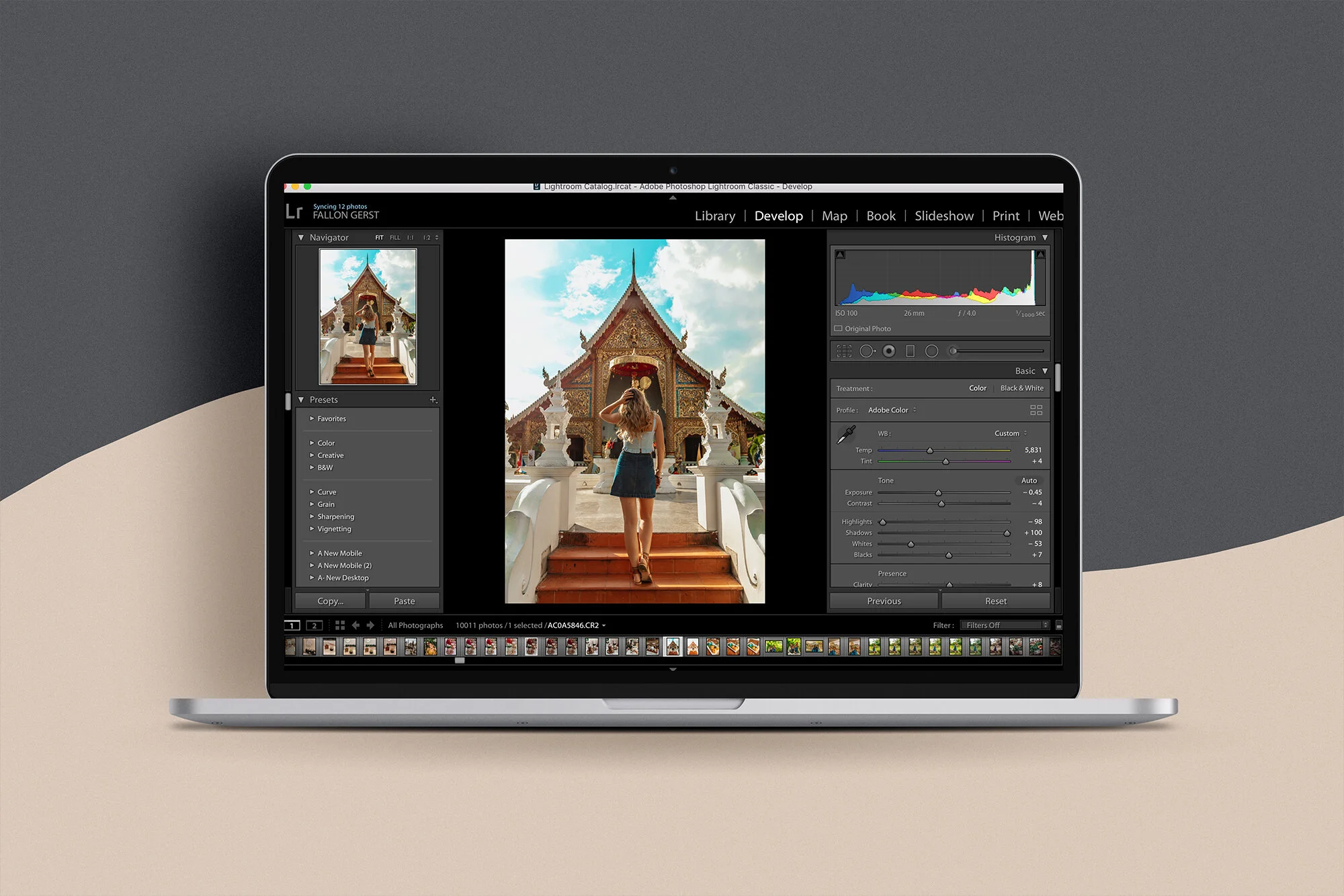
Under the develop module, on the right-hand side of your screen, you will find the white balance sliders. These sliders include ‘Temperature’, and ‘Tint’.
Temperature and Tint: The temperature slider will adjust your photo to be warmer or cooler, whereas the tint slider will adjust your photo to have a pink or green tint. Temperature and tint will usually work in tandem, so you will need to play around with these sliders until you find a happy medium for your edit. These sliders can create a very dramatic effect on the outcome of your photo edit, and you may need to customize your presets for a specific set of photos if your lighting is either too cool or too warm.
Tone:
Under the develop module, you will also find the tone sliders. You will more than likely be making adjustments to these sliders throughout your editing process. The tone sliders include ‘Exposure’, ‘Contrast’, ‘Highlights’, ‘Shadows’, ‘Whites’, and ‘Blacks’.
Exposure: The exposure slider allows you to add/subtract light to/from an image. Some photographers don’t like to mess with the exposure, because adjustments can be made more precisely by moving the ‘whites’, ‘blacks’, ‘highlights’ and ‘shadows’ sliders to focus on specific areas of an image (instead of making one large change with the exposure slider). However, because I tend to shoot my photos slightly under-exposed, I typically will increase my exposure slider just a tad to correct for the under-exposed image. The reason I shoot slightly under-exposed is because over-exposed images are much more difficult to fix/compensate for in post-processing. Bumping the slider up somewhere between +0.2 to +0.35 will typically work for me, but it all depends on the image I’m working with.
Contrast: The contrast slider allows you to make adjustments to the tonal range and can help give your image a little punch!
Highlights: Highlights bring down the exposure of the lightest areas of an image without affecting the entirety of it. I will almost always take my highlights all the way down (-100), which will bring back more image detail (i.e. detail in the sky/clouds that may have been otherwise lost).
Shadows: The shadow slider allows you to make the darkest areas darker or lighter to either get rid of unwanted detail, or to make the detail more visible. I will usually take my shadows nearly all the way up: depending on the image: somewhere between +60 to +100.
Whites: The white slider allows you to create pure white areas in your image, in order to naturalize your image further. My whites will typically go down pretty far: somewhere between -65 to -100.
Blacks: Similarly, the black slider allows you to create pure black areas in your image to naturalize your image further. I typically bring my blacks up pretty high, ranging somewhere from +70 to +100.
Presence:
The presence panel is located at the bottom of the ‘basic’ area in the develop module, and this is where you will make adjustments to ‘clarity’, ‘vibrance’ and ‘saturation’.
Clarity: Clarity is essentially another contrast tool, but for the mid-tones of an image. This is a great tool for giving your image a nice punch, however, I typically don’t make any adjustments to clarity.
Vibrance: I am a pretty big fan of vibrance (I love colorful editing styles!), just as long as the other color adjustments are appropriately compensated for. With that being said (depending on the photo), I will typically increase my vibrant anywhere from +30 to +70.
Saturation: While I love adding vibrance to my images, I’m not as much of a fan of saturation. I hardly ever increase my saturation, and will typically either keep it at 0 or slide it somewhere between -5 to -20.
Tone Curve:
In my opinion, one of the most important (yet sometimes underrated) tools in Lightroom; the tone curve represents the tonal range in a given photograph. Once adjusted, the tone curve can give a very unique (and sometimes dramatic) style to an image. The bottom left-hand corner represents the shadows, the top right-hand corner represents highlights, and the middle region represents the mid-tones. The mid-tones are then split up further into light and dark regions, and are quite simple to adjust if you know the look you’re going for. I typically will adjust my curve to be in a slight S shape, bringing down the darks ever so slightly, and bringing up the lights a bit.
Color Adjustments with HSL Sliders
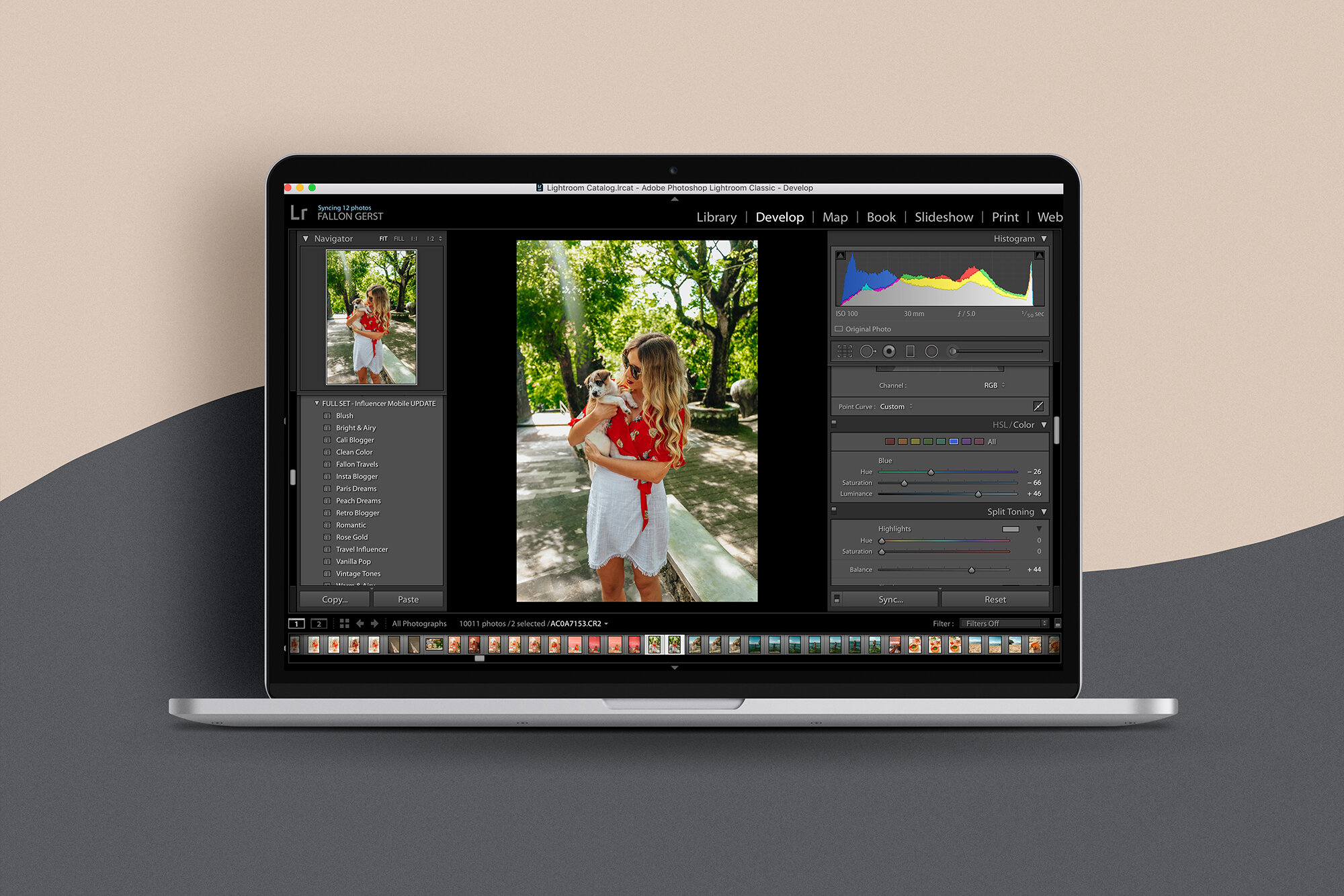
One of the most important things you should look at with Lightroom presets is the way that individual color sliders are adjusted. In Lightroom, you can make adjustments to the hue, saturation and luminance of a given color.
Hue: The hue allows you to replace entire colors in the photo, leaving other colors untouched.
Saturation: Saturation deals with the strength of a given color, either by making the main colors stronger or surrounding colors weaker.
Luminance: Luminance focuses on the brightness of a given color by either making it more prominent or by muting it.
Play around with the sliders and see what style you gravitate towards, but these are some of the color sliders I typically make adjustments for:
Orange: In terms of skin color, I tend to take the saturation of my oranges down just a bit, and my luminance down ever so slightly as well. However, watch that as it will affect your skin coloring and could make you look a bit discolored! You will more than likely need to make some adjustments based on your own skin color and see what looks the best and most natural for you.
Yellow: I personally will almost never have an image preset where my yellows are saturated or vibrant because, quite frankly, I’m just not a big fan of yellow. Saturation will be almost or all the way down, while luminosity will be all the way up. However, you NEED to be careful with this! These adjustments for yellow could break the image edit completely, which has definitely happened to me before- so watch out!
Blue: I will typically adjust my blues slightly to the left for a more aqua tint.
Green: Lately, I have been adjusting my greens to be more of a “forest green” with less saturation.
These color adjustments are all personal preference- so make any adjustments to your Lightroom presets accordingly!
Final adjustments:
The following adjustments are completely optional, and just depend on the style you are going for. I will typically increase my sharpening (amount) ever so slightly, somewhere from +10 to +25. I will go ahead and increase my noise reduction (luminance) a bit, somewhere around +20 to +40. I also typically add a bit of grain to my photo (unless shooting night photography, meaning that the image will most likely already have a bit of natural grain from a high ISO setting). I normally will increase the grain anywhere from +15 to +40, depending on the style I am going for.
*Disclosure; Some of the content above may contain affiliate links (at no cost to you). However, I would never recommend tools, apps or resources if I didn't use them and find them helpful myself.
PS— Make sure to check out my post on how to add presets to Lightroom Mobile if you want the detailed preset installation guide!


