9 Tips To Design Killer Facebook Ad Images That Sell
Disclaimer: Hey there, friend! This article includes affiliate links for Canva (a design tool I use, love & swear by) and I would love if you decided to use them. Affiliate links help creators like me to fund the free content that we provide on our blogs. Thank you for your endless support!
As consumers have access to more & more choices for products and services, it becomes increasingly difficult to stand out online. And while it’s certainly possible to grow your traffic, leads and business organically, the pesky social media algorithms make it pretty tough to stay ahead of the curve.
This is why Facebook advertising is often considered one of the most effective tools for getting more eyes on your amazing products & services.
But in order to get clicks, generate leads and ultimately make more sales from your Facebook ads, you need to stand out from your competitors. And to do that, you’re going to need an effective strategy for your Facebook ad design.
So if you’re ready to take the next step in marketing your online business, read along for my top tips on how to design killer Facebook ad images that actually sell!

1. Use a great, high-quality Image
Images are the first thing your audience will see of your ad, so they need to be designed in a way that catches your audience’s attention and “stops the scroll”.
According to BuzzSumo, Facebook posts that include an image have 2.3x more engagement (on average) than those without.
But I have some great news— you don’t have to be a professional photographer to stand out with your ad design and marketing graphics. That’s what stock photo websites are for!
Using stock photos is a great way to access stunning, professional images without having to go through the hassle (and learning curve!) of shooting your own.
Not all stock photos are created equal, though. Make sure to do your due diligence in choosing high-quality images that best represent your brand (and your Facebook ad, of course!).
Some of my favorite stock photo resources:
Canva Pro (of course!)
SC Stockshop
KateMaxStock
Unsplash
2. Include a strong Call to Action (CTA)
Include a call to action (CTA) that makes it very clear what your offer is, so your audience knows exactly what to expect when they work with you or purchase your product.
If your audience doesn’t know what to do after seeing your ad or if they aren’t sure about what’s in it for them, your ad will have a hard time gaining any serious traction. That’s why adding a strong CTA to your ad graphic is so crucial.


3. Keep it Simple
You’ll want to include enough copy on your image so that your audience understands what your ad is about (especially if the goal is to get them to purchase from you).
With that said, you don’t want to bombard someone with text overload before they’ve even had the chance to read your actual ad copy.
In fact, Facebook requires that overlay text does not exceed 20% of the image area.
So what’s a savvy business owner to do? Get creative with your copy and include only the necessary information to get your audience from point A (the ad) to point B (your offer).

4. Address your Audience’s Pain Points in the Overlay Text
While you don’t want to include an overload of text on your ad image, you want to make sure that the copy you do use addresses your audience’s biggest pain point(s).
What are they struggling with the most right now, and how is that relevant to your offer?
Use the following prompts if you’re feeling stuck on your ad design copy:
How to [the result of your paid offer] in less than [time frame it takes to do the work].
Are you ready to say goodbye to [the pain point/problem you’re helping your audience solve with your freebie or paid offer]?
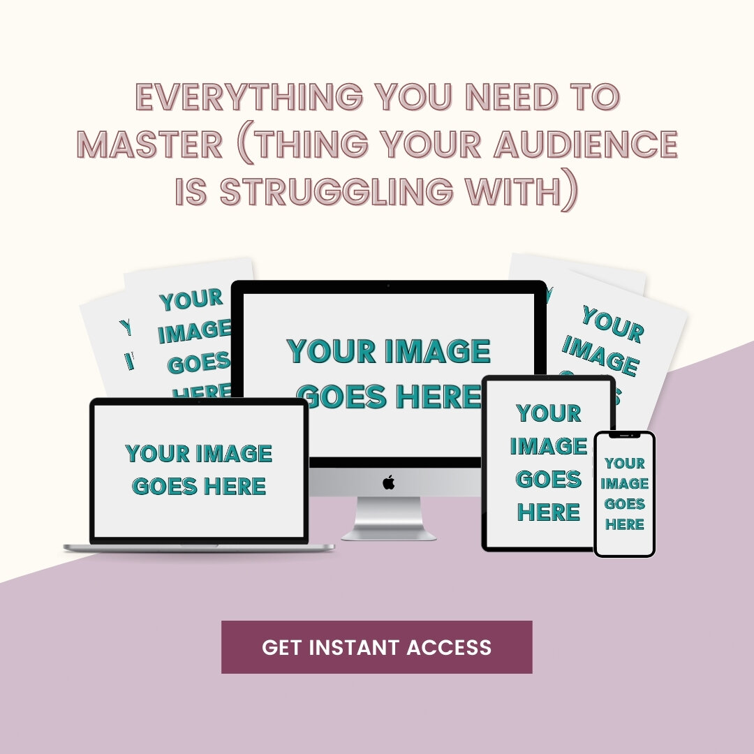
Everything you need to master [thing your audience is struggling with] in half the time.

5. Use Digital Mockups that showcase your Offer
Because digital products are intangible (hence the name), it can be pretty difficult to describe them using visuals. And that’s where mockups come in!
Try using a high quality tech mockup that effectively showcases your products and services. Here’s a few mockup assets you could include, depending on your offer:
Laptop
Desktop computer
iPad/tablet
iPhone or Android device

6. Use a testimonial or Case Study
Especially when it comes to your warm audiences (because they’ll be that much closer to purchasing from you!), it’s important to test out ad images that provide social proof in the form of a testimonial or case study.
Including a testimonial that showcases how your product or service changed someone else’s life might just be the confidence your audience needs to purchase from you!
Have a look at the graphics below to get a feel for the kind of ad images you could design using testimonials.

It’s worth noting: you want to make sure you highlight the RIGHT testimonial— one that hits on the biggest pain point your audience is currently experiencing.
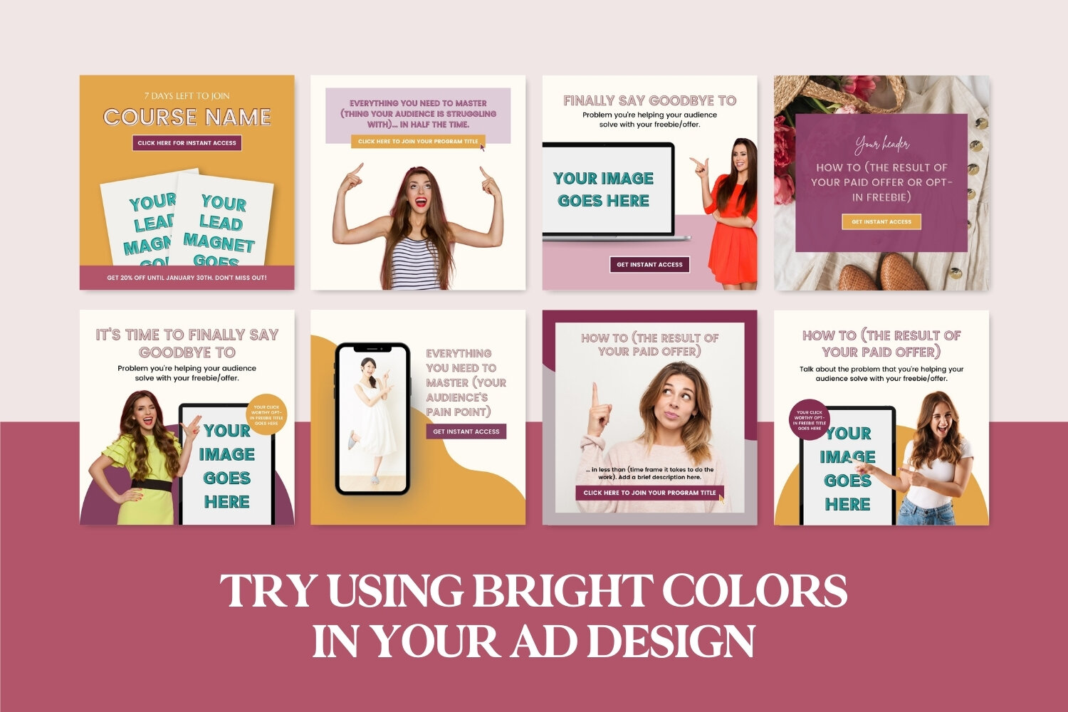
7. Try using bright, eye-catching Colors
While you want to try and keep your images as on-brand as possible (as this establishes trust with your audience), you also want to make sure you can stop them in their tracks with your ad design!
Typically, bright and engaging colors work best in getting your audience to stop what they’re doing and check out your offer.
Here’s a quick color theory cheatsheet if you’re ever feeling stuck on colors:
Red: powerful, passionate, bold
Orange: creative, playful, dynamic
Yellow: optimistic, energetic, positive
Green: calm, balanced, fresh
Blue: trustworthy, serene, loyal
Purple: ambitious, sophisticated, luxurious
Pink: feminine, compassionate, sentimental
8. Be consistent with your Ad Design Graphics
Let’s say you’re scrolling on Facebook and come across an Ad that has bright, stand-out colors. Not only does the design resonate with you, the offer is something you could definitely use in your life— great!
The only problem is that once you click on the Ad, you’re brought to a landing page with dark, moody branding. Now you just feel confused and start questioning whether you’re even in the right place. And then… you exit.
Ouch.
That’s how powerful consistent branding can be! Don’t confuse your audience with a ton of different Ad graphics if the colors, fonts and style don’t match up. Here’s a few design tips if you’re struggling to keep your branding consistent:
Try to stick with 2-4 colors (ideally 2 strong complimentary colors).
Use 2-3 fonts max (ideally 1 serif font and 1 sans-serif font).
If you feel like the Ad looks too simple (simple is better than cluttered, though!), you can try switching up the styles slightly. For example, use a mix of uppercase and lowercase text in your Ad copy, or try adding more spacing in between your letters.
9. Save time with Canva Facebook Ad Templates
Want to make your Facebook Ad design workflow a piece of cake? Then definitely check out my Facebook & Instagram Ad Template Bundle for Canva!


You’ll get access to over 40+ ready-to-use Facebook & Instagram Ad Templates that will empower you to create click-worthy marketing graphics for your online biz in minutes with Canva!
Canva is a free online design app that makes creating your own graphics as simple as dragging-and-dropping your content in. All with, you guessed it— zero graphic design knowledge (and without having to hire an expensive designer!).
Your time is valuable, friend— don’t waste endless hours trying to create beautiful graphics if that’s just not your thing.
If you enjoyed this, share the love!
If you found this information helpful, feel free to save it for later by pinning any image in this article to one of your boards on Pinterest!