How to Create Pinterest Blog Graphics (that actually convert!)
Disclaimer: Hey there, friend! This article includes affiliate links and I would love if you decided to use them. Affiliate links help creators like me to fund the free content that we provide on our blogs. Thank you for your endless support!

Feel like you’re missing out on the big Pinterest secret?
All these bloggers keep raving about their traffic and how they’re getting thousands of page views from Pinterest, while all you hear is…
…crickets.
Yep— I’ve definitely been in your shoes, my friend.
I’m gonna let you in on one very big “secret”, that might actually be staring you straight in the face (it was for me, anyway)…
…your pin templates, graphics & visuals are not designed to convert.
Hey, don’t feel bad— mine weren’t either, and I’m a designer (how ironic).
If you’ve ever had a sneaky little suspicion that there was a science to high-converting pins…
… well then, my friend— you were correct. And I’m gonna lay it allll out for you in this post.
So grab a cup of coffee, get comfy & prepare to have your mind blown about all things #PinDesign.
Let’s do this thang. ;)
Pinterest Algorithm & Fresh Pins in 2020
Pinterest recently opened up with one of their approved partner companies, Tailwind, about some of the latest algorithm changes.
While there’s a lot that goes into the algorithm, the update that everyone seems to be talkin’ about is: fresh pins. A “fresh” pin simply means:
Creating a new pin from old content
Or creating a new pin from new content
In a nutshell, Pinterest will consider a pin fresh when a new image is uploaded to the platform, and this can be for any given page on your website (i.e. blog post, landing page etc).
Which means that, while Pinterest will always prioritize content that’s both recent and relevant…
…recency is now going to be more important than relevancy when it comes to pin success.
This means that you can no longer just cruise on viral pin success. And Pinterest is going to make you work harder to stay relevant in the smart feed.
Ultimately, we all want our businesses to thrive for the long-haul (am I right or am I right?!). Creating fresh pins (on a consistent basis!) simply ensures that your audience will get the best possible experience from your content.
Top Design Tips for Pinterest Graphics
I’ve rounded up my top tips & tricks for designing click-worthy Pinterest graphics, but first…
…I thought you might want to know some important stats before we get into the nitty gritty design details.
Pinterest Image Case Study
The team at Curalate reviewed over 500,000 images on Pinterest to see how visual features (i.e. colors, presence of faces, etc) impacted conversions.
Here’s a few important things to note:
Red, orange and brown images (on average) get twice as many repins as blue images
Images with multiple dominant colors get roughly 3.25x more repins than images with just one dominant color
Pin images without faces get 23% more repins
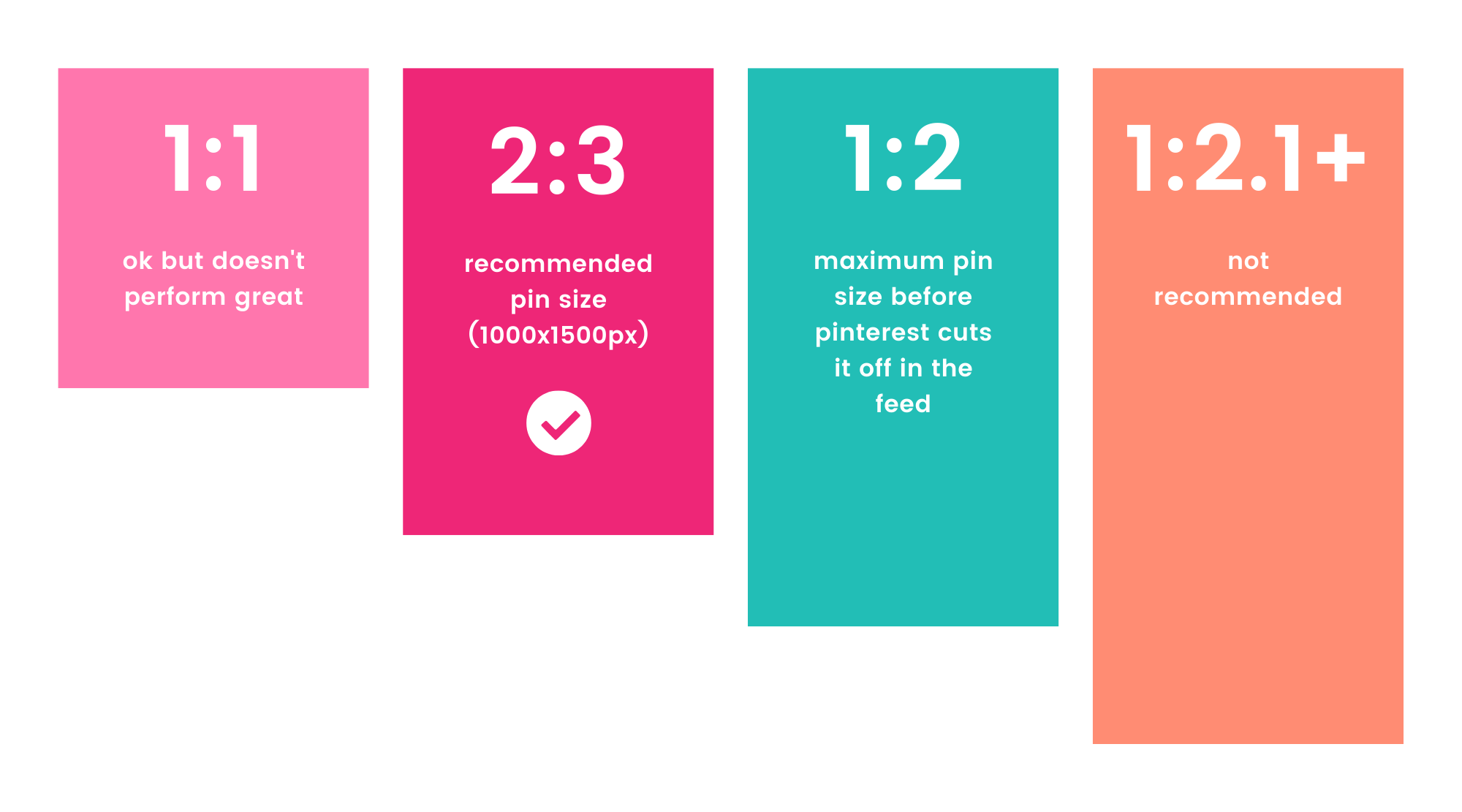
Choose the best Pinterest Image Size
You’ll need to create your pin using the correct dimensions. Now, regardless of the size you choose— your pin should always be vertical.
Aside from just vertical, Pinterest recommends creating your pin in a 2:3 aspect ratio - anything greater than 2:3 might get cut off in people’s feeds.
Common variations of 2:3 include:
600x900px
1000x1500px (what I use and what Pinterest recommends)
You can also test out pins in a 1:2 aspect ratio, but this is at your own discretion. 1:2.1 is the maximum aspect ratio you can use before Pinterest cuts it off. Variations include:
600x1200px
I’ve tested both and I do see higher engagement with my 2:3 pins, so that’s what I’m sticking with. But definitely a/b test pin sizes and see what works best for your content!
Choose a font that’s simple to read
Alright, I’m just going to put this one out there…
Font choice is one of the most important factors if you want your pin to actually drive traffic back to your site.
Today, more than 75% of Pinterest users are browsing from their mobile devices.
Font readability is a huge factor in the success of your pin— your text 110% needs to be large enough for mobile device and tablet screens.
This is what I’ve found performs best:
Sans serif fonts (aka fonts without the little embellishments or “feet”)
Bold
Uppercase (easier for Pinterest to read)
To give you some context, I designed a few pins for a sweet friend of mine who runs a Europe-focused travel blog— YoursTrulyRebecca.com.
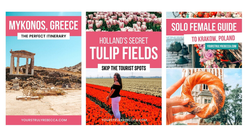
Notice how the font is bold, uppercase and super easy to read? This helps your content stand out among the sea of Pinners!
And bold, uppercase text is easier for Pinterest to analyze. On that note…
Pinterest uses Optical Character Recognition— essentially, this means that Pinterest can read the actual text in your pin image.
So in terms of script fonts, I would just be cautious if you’re a beginner and don’t know much about graphic design.
I won’t say to avoid them completely (because that would make me a hypocrite) but just make sure you’re not using a script font for any important keywords.
Here’s a few final tips:
Try to stick to 2-3 fonts max (PS— this rule applies for pin graphics and general branding graphics!)
Font Pairings: Don’t reinvent the wheel! There are plenty of font pairing resources available— like my Ultimate Guide to Canva font combinations! :)
Your title must be eye-catching & simple to read. If your audience can’t even read the text, you can bet your booty that they won’t be engaging with the pin!
Choose the right Pin image
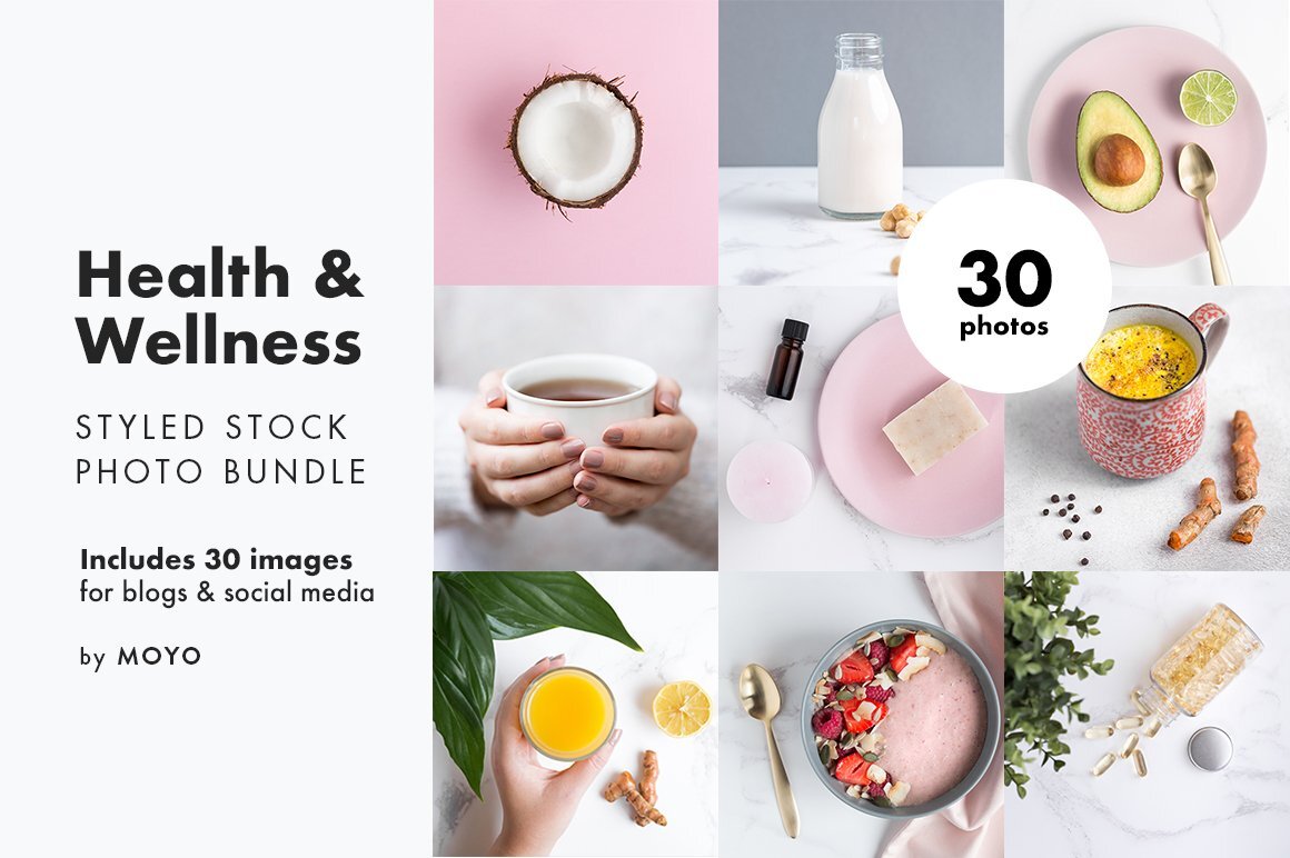
If you don’t plan on using custom photos for the pin image, stock photography is a great option!
The Canva Pro plan includes plenty of stock photos to choose from, but I personally recommend purchasing a stock photo bundle from Creative Market or another shop owner.
Some of my personal fave stock photo shops are Moyo Studio and Kate Max Stock .
Feeling lost on where to find styled stock photography? Don’t worry, friend - I’ve got you covered!
Check out my guide to the best stock photo sites for bloggers. :)
How to choose the right colors
Pins with multiple colors typically get more engagement.
With that said… you don’t want to go overboard or the design will become distracting & overwhelming (not what we’re trying to go for here!).
Try to stick with 1-3 color swatches for each Pinterest graphic— anything over 3 and you’ll risk distracting your audience.
If you need help with brand colors, Canva has its own color generator tool. You can just upload a photo and it will auto-generate the colors from your image. They also have pre-made color swatches if you need some inspiration!
My personal fave color tool is the ColorZilla Chrome extension . This bad boy will pull the color from any single pixel on your browser...
…so you can finally stop hoarding all those screenshots in your “color inspiration” desktop folder (or maybe I’m the only weirdo who does that).
Alright, friend— that’s a wrap from me on how to create high-converting Pinterest graphics!
I hope this article was helpful, but feel free to drop a comment below with any questions you have! Remember, we’re in this blogging journey together. :)
Excited to see what you create!
Chat soon, friend!
XO, Fal
If you enjoyed this, share the love!


